可以对z-index添加CSS3动画
利用CSS3的动画来改变z-index的值,先来看一下效果,愤怒的小鸟,叽叽啾~~ :CSS3动画:z-index
实现过程
HTML结构
HTML中,我们用几层DIV来模仿障碍物,然后把小鸟的图片也引入:
<img src="angrybird.png" class="mover">
<div class="ground ground-1"></div>
<div class="ground ground-2"></div>
<div class="ground ground-3"></div>
CSS
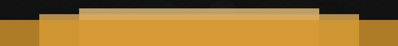
先将障碍物的位置放好,给它们设置不同的透明度,不同的z-index(一层堆一层):
.ground {
  background: rgba(lighten(#ae7b22, 10%), 0.8);;
  height: 100px;
  position: absolute;
  bottom: 0;
  left: 0;
  width: 100%;
  z-index: 3;
}
.ground-2 {
  background: rgba(lighten(#ae7b22, 20%), 0.8);
  left: 10%;
  width: 80%;
  height:120px;
  z-index: 2;
}
.ground-3 {
  background: rgba(lighten(#ae7b22, 30%), 0.8);
  left: 20%;
  width: 60%;
  height: 140px;
  z-index: 1;
}
得到这个效果:
定义 move 动画,让z-index从0变到5,同时改变缩放值:
@-webkit-keyframes move {
  from {  z-index: 0; -webkit-transform: scale(1); }
  to { z-index: 5; -webkit-transform: scale(2.5); }
}
@-moz-keyframes move {
  from {  z-index: 0;-moz-transform: scale(1); }
  to { z-index: 5;-ms-transform: scale(2.5); }
}
@-o-keyframes move {
  from {  z-index: 0; -o-transform:  scale(1); }
  to { z-index: 5; -o-transform:  scale(2.5); }
}
@keyframes move {
  from {  z-index: 0; transform:  scale(1); }
  to { z-index: 5; transform:  scale(2.5); }
}
将move动画应用到小鸟(.mover)身上(动画时间4s,无限来回循环):
.mover {
  width: 100px;
  position: absolute;
  left: 50%;
  margin-left: -50px;
  bottom: 100px;
  z-index: 0;
  -webkit-animation: move 4s linear infinite alternate;
     -moz-animation: move 4s linear infinite alternate;
       -o-animation: move 4s linear infinite alternate;
          animation: move 4s linear infinite alternate;
}


 加载中 ...