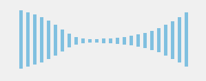
你:声波动画,听起来一点都不厉害,放出来看看啊!
我:好吧,是不厉害。。。可是,你打我呀~你打我呀,哈哈
你:…..
实现方法
HTML
其实,声波就是一个一个的HTML标签(我用的是i,一共25个)。
<div class="waves">
  <i></i>
  <i></i>
  <i></i>
  <i></i>
  <i></i>
  <i></i>
  <i></i>
  <i></i>
  <i></i>
  <i></i>
  <i></i>
  <i></i>
  <i></i>
  <i></i>
  <i></i>
  <i></i>
  <i></i>
  <i></i>
  <i></i>
  <i></i>
  <i></i>
  <i></i>
  <i></i>
  <i></i>
  <i></i>
</div>
CSS3
step1-初始化声波
先把这些声波(i)铺开来,默认是5*5的大小。
.waves{
  position:relative;
  width:260px;
  margin:0 auto;
  padding:60px 0;
  i{
    display: inline-block;
    position: absolute;
    height:5px;
    width:5px;
    background:skyblue;
    @for $i from 1 through 25 {
      &:nth-last-child(#{$i}){
        left : #{($i)*10}px;
      }
    }
  }
}
step2-定义声波动画
定义一个keyframes动画
@-webkit-keyframes shake {
  0% { height: 5px; margin-top: 0; }
  50% { height: 100px; margin-top: -50px; }
  100% { height: 5px; margin-top: 0; }
}
@keyframes shake {
  0% { height: 5px; margin-top: 0; }
  50% { height: 100px; margin-top: -50px; }
  100% { height: 5px; margin-top: 0; }
}
是的,上面的keyframes很简单。但我还是要解释一下,为什么呢?因为。。。我要和你分享啊~~~哈哈.
动画在0%的时候,高度为5px。在50%的时候,margin-top设置成了高度的一半100px/2 = 50px(负的),这是为了让它在垂直方向上居中。100%再恢复原状。
step3-使用动画
在使用上面定义的动画时,需要注意的是,25个声波不是一起动,而是一个接着一个,所以重点是在延时。
.waves{
  i{
    @for $i from 1 through 25 {
      &:nth-last-child(#{$i}){
        -webkit-animation : shake 1s #{($i)/35}s infinite;
      }
    }
  }
}
想知道上面的35是怎么来的吗?嗯,我不想装高手,其实那个35。。。是试出来的,哈哈。
如果你对scss不熟悉的话,那么可以看生成的css:
.waves i:nth-last-child(1) {
  -webkit-animation: shake 1s 0.02857s infinite;
}
.waves i:nth-last-child(2) {
  -webkit-animation: shake 1s 0.05714s infinite;
}
.waves i:nth-last-child(3) {
  -webkit-animation: shake 1s 0.08571s infinite;
}
.waves i:nth-last-child(4) {
  -webkit-animation: shake 1s 0.11429s infinite;
}
.waves i:nth-last-child(5) {
  -webkit-animation: shake 1s 0.14286s infinite;
}
.waves i:nth-last-child(6) {
  -webkit-animation: shake 1s 0.17143s infinite;
}
.waves i:nth-last-child(7) {
  -webkit-animation: shake 1s 0.2s infinite;
}
.waves i:nth-last-child(8) {
  -webkit-animation: shake 1s 0.22857s infinite;
}
.waves i:nth-last-child(9) {
  -webkit-animation: shake 1s 0.25714s infinite;
}
.waves i:nth-last-child(10) {
  -webkit-animation: shake 1s 0.28571s infinite;
}
.waves i:nth-last-child(11) {
  -webkit-animation: shake 1s 0.31429s infinite;
}
.waves i:nth-last-child(12) {
  -webkit-animation: shake 1s 0.34286s infinite;
}
.waves i:nth-last-child(13) {
  -webkit-animation: shake 1s 0.37143s infinite;
}
.waves i:nth-last-child(14) {
  -webkit-animation: shake 1s 0.4s infinite;
}
.waves i:nth-last-child(15) {
  -webkit-animation: shake 1s 0.42857s infinite;
}
.waves i:nth-last-child(16) {
  -webkit-animation: shake 1s 0.45714s infinite;
}
.waves i:nth-last-child(17) {
  -webkit-animation: shake 1s 0.48571s infinite;
}
.waves i:nth-last-child(18) {
  -webkit-animation: shake 1s 0.51429s infinite;
}
.waves i:nth-last-child(19) {
  -webkit-animation: shake 1s 0.54286s infinite;
}
.waves i:nth-last-child(20) {
  -webkit-animation: shake 1s 0.57143s infinite;
}
.waves i:nth-last-child(21) {
  -webkit-animation: shake 1s 0.6s infinite;
}
.waves i:nth-last-child(22) {
  -webkit-animation: shake 1s 0.62857s infinite;
}
.waves i:nth-last-child(23) {
  -webkit-animation: shake 1s 0.65714s infinite;
}
.waves i:nth-last-child(24) {
  -webkit-animation: shake 1s 0.68571s infinite;
}
.waves i:nth-last-child(25) {
  -webkit-animation: shake 1s 0.71429s infinite;
}
上面的延时时间是SCSS自动计算出来的,哈哈。
最后,上个demo:


 加载中 ...
关于动画,难的是原理,而不是代码实现