该篇为翻译文章,原文地址为:Building Resizeable Components with Relative CSS Units
这篇文章由 Ahmad Shadeed所写,Ahmad通过大量的示例向我们展示说明了使用相对单位会给我们带来的种种好处。我相信大部分人都想当然的认为像
em这样的单位只是用来设置font-size。但实际上,这些相对单位的用处远远不止这一个。这篇文章会告诉你如何在元素排版的各方面来使用相对单位。
我们生活在一个快速发展的世界,身边所有的事物无时不刻都不在变化。而作为前端开发的我们,也要让我们的的布局来适应各种变化。
我会介绍如何使用CSS的相对单位(%,em,rem)来控制所有的UI组件,而不仅仅是控制字体大小。我们将通过一些非常实用的例子来展示这种方法的好处、坏处,还会告诉你一个完整的页面如何进行控制。
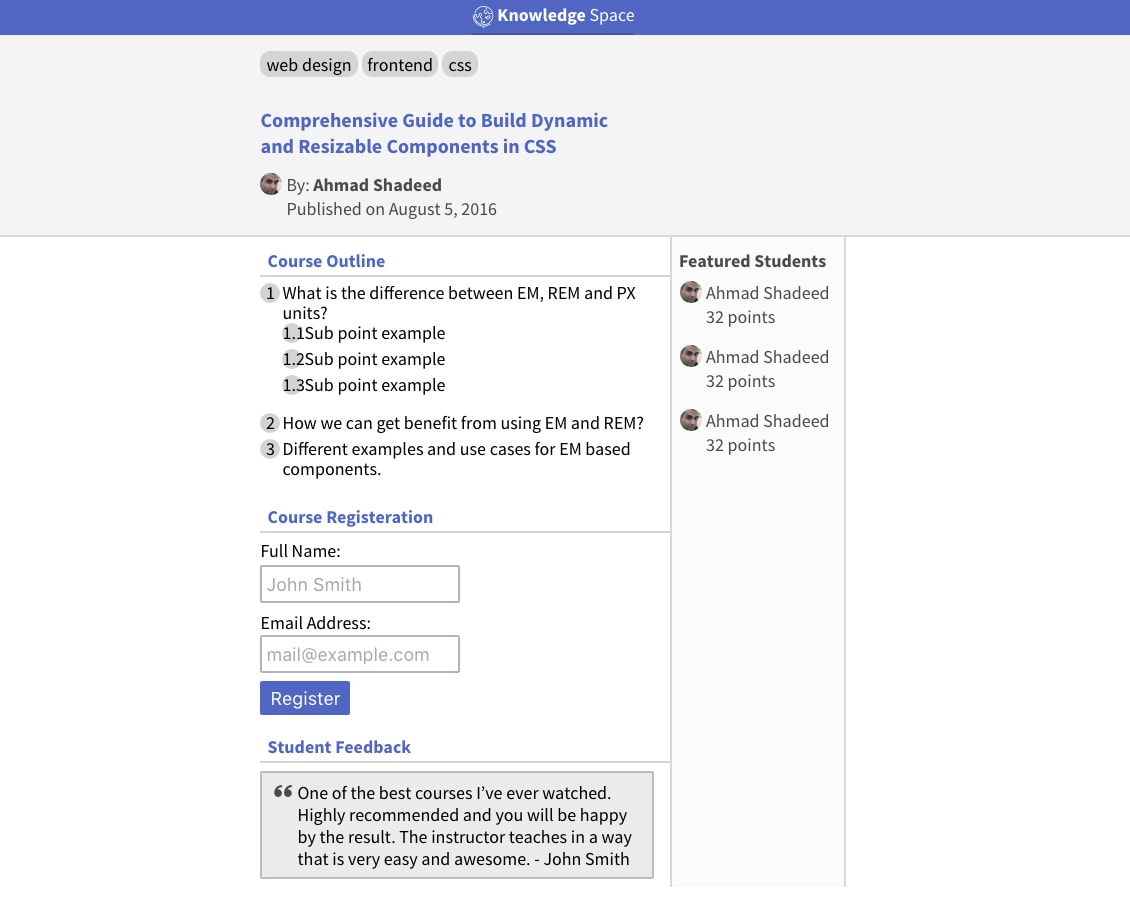
一个字号等比的简单示例
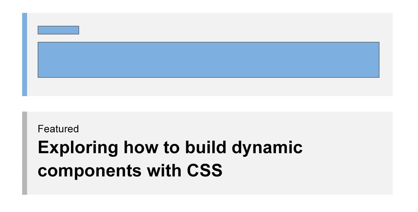
从上图可以观察到有三块东西:
- 副标题
- 标题
- 左边框
HTML结构就像这样:
<article class="post">
   <a href="#">
     <span class="post-category">Featured</span>
     <h2 class="post-title">Building Dynamic Components is Awesome</h2>
   </a>
</article>
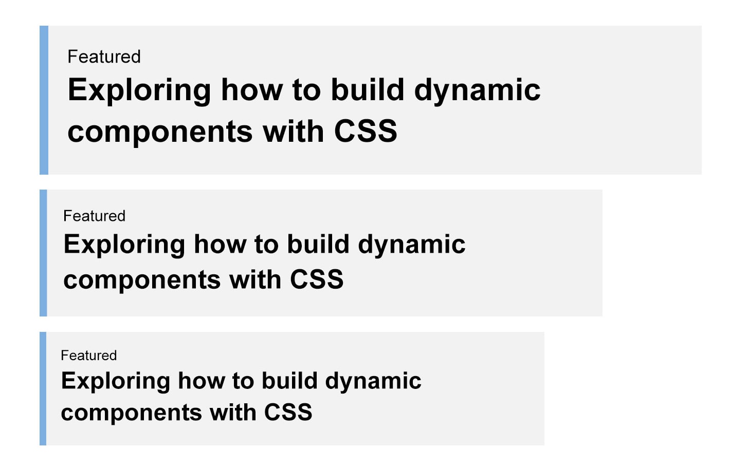
我希望当页面进行缩放的时候,上面所有展示出来的东西都进行等比缩放:
如果不用相对单位,那么就是这样(使用px):
.post {
  border-left: 4px solid #4a90e2;
}
.post-category {
  font-size: 14px;
  color: #7d7d7d;
}
.post-title {
  font-size: 36px;
  font-weight: bold;
  color: #4a90de;
}
这样如果想对组件进行等比例的调整,惟一的方法就是在不同的尺寸对每个元素的font-size通通进行调整。
想让这一操作变的稍微简单点儿,那么我们可以使用%来进行调整。
.post-category {
  font-size: 85%;
}
.post-title {
  font-size: 135%;
}
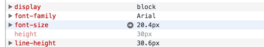
上面代码中,比如.post-category的font-size:85%的意思就是以离它最近的并且定义了font-size的祖先元素为基准进行字体大小的调整。
我们现在到父级上设置一个font-size:
.post {
  font-size: 24px;

  /*
    Child elements with % font sizes...

    85%
    0.85 * 24 = 20.4

    135%
    1.35 * 24 = 32.4
  */
}
这个时候,所有设置的百分比,浏览器都会进行自动的计算:
另外,我们也可以使用em来达到同样的效果:
.post-category {
  font-size: 85%;
  /* the same as */
  font-size: 0.85em;
}
.post-title {
  font-size: 135%;
  /* the same as */
  font-size: 1.35em;
}
当我们使用em的时候,所有的属性都是依据font-size来进行计算的。这和%是有很大区别的,比如给width设置了%,那么它是根据父级的width来进行计算的,而不是font-size!
比如,我们来使用em设置边框:
.post {
  font-size: 24px;
  border-left: 0.25em solid #4a90e2;
}
border-left-width将会被计算成6px。
下面让我们通过可交互的Demo感受一下,第一个全是使用px,第二个使用em:
http://codepen.io/shadeed/pen/5037e798ccb88eb220f26540e6886f5c
等比缩放的按钮
有时候,我们希望我们的按钮也是能灵活一些,进行等比进行缩放的。这个时候,我们就可以使用em来设置按钮的padding,这样,我们可以通过设置font-size来影响padding。
<button class="button">Save Settings</button>

<button class="button button--medium">Save Settings</button>

<button class="button button--large">Save Settings</button>
如果我们用px来进行设置,那么一切都是固定死的:
.button {
  font-size: 16px;
  padding: 10px 16px;
  border-radius: 3px;
}

.button--medium {
  font-size: 24px;
  padding: 15px 24px;
  border-radius: 4px;
}

.button--large {
  font-size: 32px;
  padding: 20px 32px;
  border-radius: 5px;
}
而如果我们使用em和%来进行替代的话,包括border-radius:
.button {
  font-size: 1em; /* Let's say this computes to 16px */
  padding: 0.625em 1em; /* 0.1875 * 16 = 10px */
  border-radius: 0.1875em; /* 0.1875 * 16 = 3px */
}

.button--medium {
  font-size: 130%;
}

.button--large {
  font-size: 160%;
}
在线Demo:http://codepen.io/shadeed/pen/f2de84b1d64c07b5085f2e4dadbca4e1
宽高等比图片
看下面这个例子,头像图片在左边,但随着我们的font-size的变化,它的宽高比永远一样,并且上面和下面超出的部分永远一样,即顶部超出署名一点点,底部超出日期一点点:
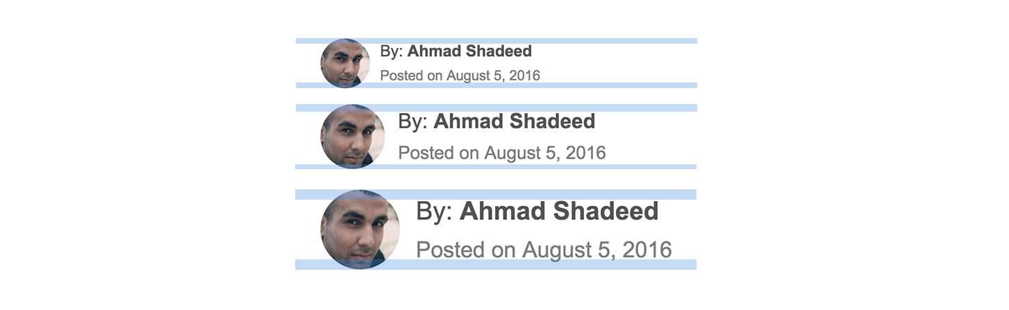
HTML结构:
<div class="bio">
  <img src="author.jpg" alt="Photo of author Ahmad Shadeed">
  <div class="bio__meta">
    <h3><b>By:</b> Ahmad Shadeed</h3>
    <time>Posted on August 5, 2016</time>
  </div>
</div>
这个时候,我们不但要对字体大小使用em,对于图片的宽高也要使用em。
.bio h3 {
  font-size: 1em;
}
.bio time {
  font-size: 0.875em;
}
.bio img {
  width: 3.125em;
  height: 3.125em;
}
可缩放的边框
另外一个可以使用em来得到很好效果的属性就是box-shadow。

我们已经知道边框可以使用em进行设置以达到自由缩放的目的。其实,我们还可以设置box-shadow来达到同样的效果:
.headline {
  box-shadow: inset 0 -0.25em 0 0 #e7e7e7;
}
在线Demo:http://codepen.io/shadeed/pen/2ec1144b424ca7017c22fea52aa01494
可缩放的图标
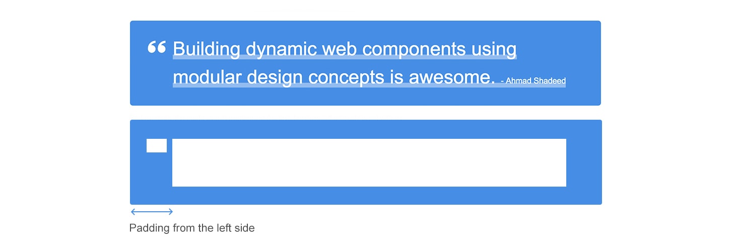
假如现在我们有一个<blockquote>的装饰在文字的左上方。我们仍然可以使用相对单位。
<blockquote class="quote">
  <p>
    <span>
      Building dynamic web components using modular design concepts is awesome.
      <em>- Ahmad Shadeed</em>
    </span>
  </p>
</blockquote>
可以看到,HTML当中是没有图标装饰的,我们使用CSS中的:before来进行设置,并且所有的属性都使用em来进行设置。
.quote {
  position: relative;
  padding: 1.5em 2em;
  padding-left: 4.5em;
  border-radius: 0.3125em;
}
.quote p {
  font-size: 2em;
}
.quote span {
  box-shadow: inset 0 -0.25em 0 0 rgba(255, 255, 255, 0.4);
}
.quote:before {
  content: "";
  position: absolute;
  top: 2.125em;
  left: 1.875em;
  background: url("quotes.svg") no-repeat;
  height: 1.875em;
  width: 1.875em;
}
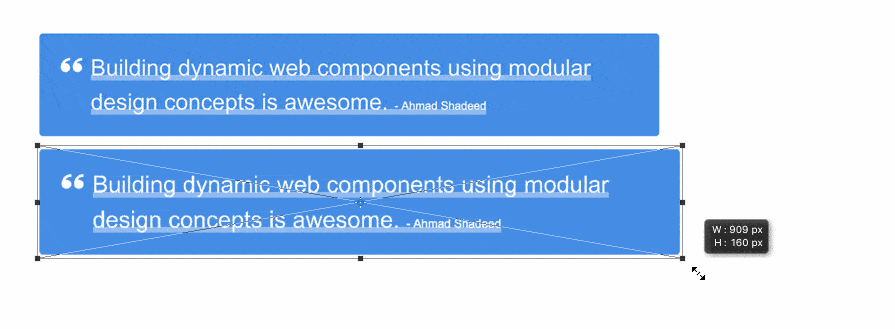
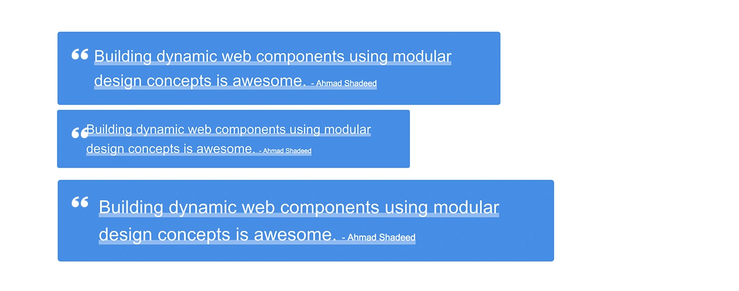
按照上面这样设置,如果我们改变字体大小,所有的东西都将会按着我们预想的那样进行缩放:
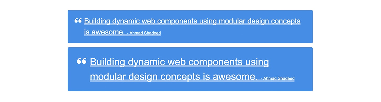
注意,所有的东西都进行了等比缩放,就像我们在一些设计软件(如Adobe Photoshop、Sketch等)里面进行拖拽缩放一样:
而如果我们使用px来进行设置的话,则会变的看不下去:
在线Demo:http://codepen.io/shadeed/pen/6c9015e777886666ce827db88da704b9
针对标题字幕
比如在图片上添加字幕说明:
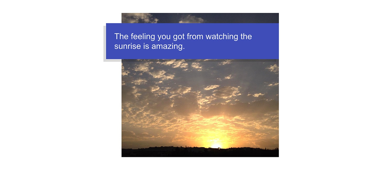
我们可以根据font-size来设置很多东西,比如字幕的left和top,padding,甚至是box-shadow。
<figure class="figure">
  <img src="sunrise.jpg" alt="Sunrise">
  <figcaption>The feeling you got from watching the sunrise is amazing.</figcaption>
</figure>
.figure figcaption {
  position: absolute;
  top: 1.25em;
  left: -1.875em;
  right: 0;
  padding: 1em;
  box-shadow: -0.3125em 0.3125em 0 0 rgba(0, 0, 0, 0.15);
  font-size: 1.75em;
}
在线Demo:http://codepen.io/shadeed/pen/c51b4e5d3e635e1bfc8d9fe499c247d6
装饰性的背景
例如在标题上加一个深色的圆形背景作为装饰:
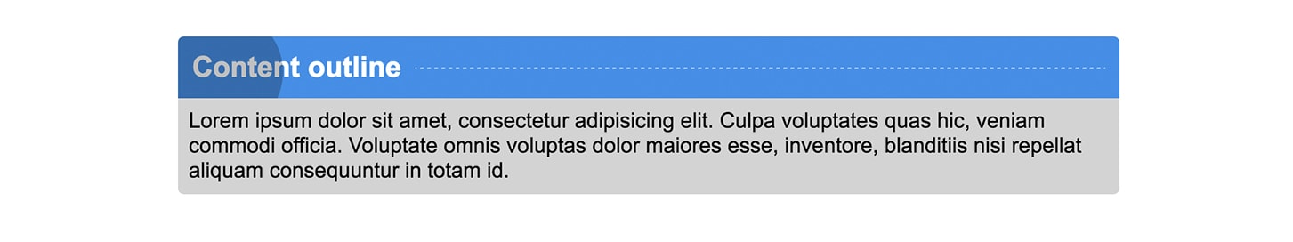
我们要让装饰随着字号大小的改变而进行改变。但是在这个标题里面还有一个细节,比如说圆角,还有标题右边的点划线。
<section class="block">
  <h3 class="block__title">Content outline</h3>
  <div class="block__content">
    <p>Description to be there....</p>
  </div>
</section>
.block__title {
  position: relative;
  font-size: 1.5em;
  padding: 0.5em;
}

.block__title:after {
  content: "";
  position: absolute;
  left: 0.25em;
  top: 0;
  width: 2.5em;
  height: 2.5em;
  border-radius: 50%;
  background: #000;
  opacity: 0.5;
  transform: scale(1.75);
}

.block__title:before {
  content: "";
  margin-left: 0.5em;
  border-bottom: 0.0625em dashed rgba(255, 255, 255, 0.5);
}
在线Demo:http://codepen.io/shadeed/pen/8993265d72b2dc808ed144ff8a448295
带图标的搜索框
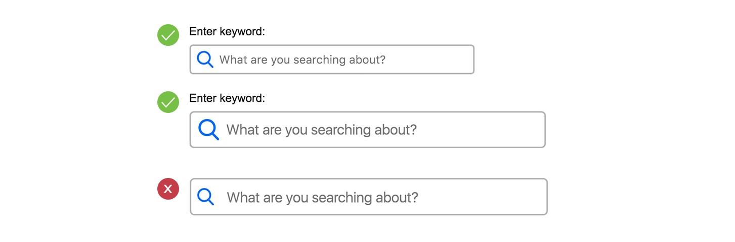
图标是通过background-image加上去的,并且设置padding-left来给它腾出位置。如果字号增长了,那么图标也应该随着它增长。
<form class="search">
  <label for="search">Enter keyword:</label>
  <input type="search" id="search" placeholder="What are you searching about?">
</form>
.search input {
  width: 25em;
  font-size: 1em;
  padding: 0.625em;
  padding-left: 2.5em;
  border-radius: 0.3125em;
  border: 0.125em solid #b4b4b4;
  background: url("search.svg") left 0.625em center/1.5em 1.5em no-repeat;
}
所有的属性都使用相对单位来时行设置,包括padding、border、border-radius、background-position和background-size等等。
在线Demo:http://codepen.io/shadeed/pen/a9eabeb1090744105254dd52fc2f6a6b
开关
假如我们现在把checkbox自定义成了一个开关的样子:
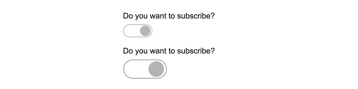
<form action="" class="switch">
  <p>Do you want to subscribe?</p>
  <input type="checkbox" name="" id="switch" class="off-screen">
  <label for="switch"><span class="off-screen">Do you want to subscribe?</span></label>
</form>
.switch label {
  width: 5.625em;
  height: 2.5em;
  border: 0.125em solid #b4b4b4;
  border-radius: 2.5em;
}

.switch label:before {
  content: "";
  right: 0.25em;
  top: 0.21875em;
  width: 2em;
  height: 2em;
}
在线Demo:http://codepen.io/shadeed/pen/1179b6e57a4fbe914bf099743b4e6945
在需要的时候限制行的长度
假设有这样一块内容:
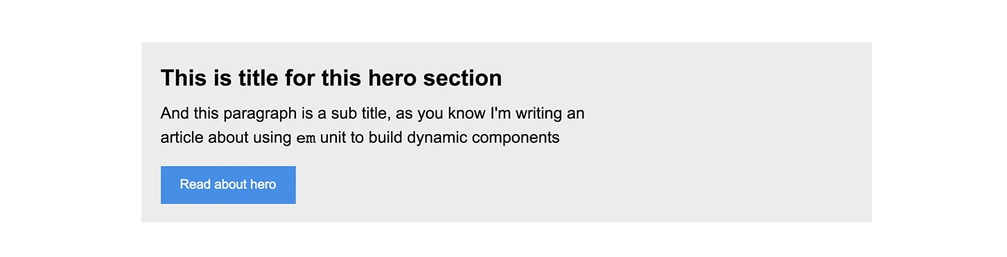
上图中,在水平方向上仍然有很多的空白空间。如果不做任何限制的话,那么段落将会特别的长以致于看起来很不舒服。设置max-width是一个很好的方法,只不过,我们并不是用px来设置它,而是用相对单位。
<div class="hero">
  <h2>This is title for this hero section</h2>
  <p>And this paragraph is a sub title, as you know I'm writing an article about using em units to build dynamic components.</p>
  <a href="#">Read about hero</a>
</div>
.hero h2 {
  margin-bottom: 0.25em;
  font-size: 1.75em;
}

.hero p {
  margin-bottom: 1em;
  max-width: 28.125em; /* limit line length */
  font-size: 1.25em;
}

.hero a {
  display: inline-block;
  background: #4a90e2;
  padding: 0.7em 1.5em;
}
在线Demo:http://codepen.io/shadeed/pen/df7e6366a508171035ab9d5c96683eb5
按钮中的SVG图标
很多人都喜欢使用字体图标,因为它就是文字,你可以使用一切控制文字的属性来控制它。但我们还可以使用<svg>图标。
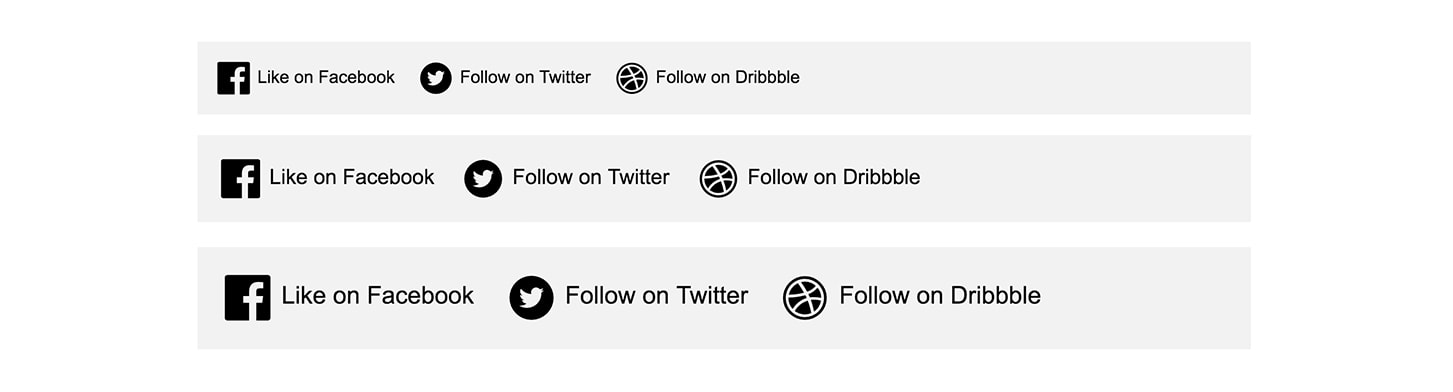
同样的,我们使用em来设置svg的width和height。
<ul class="social">
    <li class="social__item">
      <a href="#">
        <svg width="32" height="32" viewBox="0 0 32 32">
        <!-- SVG Data -->
        </svg>
        Like on Facebook
      </a>
    </li>
    <li class="social__item">
      <a href="#">
        <svg width="32" height="32" viewBox="0 0 32 32">
        <!-- SVG Data -->
        </svg>
        Follow on Twitter
      </a>
    </li>
    <li class="social__item">
      <a href="#">
        <svg width="32" height="32" viewBox="0 0 32 32">
        <!-- SVG Data -->
        </svg>
        Follow on Dribbble
      </a>
    </li>
</ul>
.social__item svg {
  display: inline-block;
  vertical-align: middle;
  width: 2.1875em;
  height: 2.1875em;
}
在线Demo:http://codepen.io/shadeed/pen/06fb18a477bd6f2bf4b4f52db4adc424
列表数字
假如我们自定义了一个有序列表:
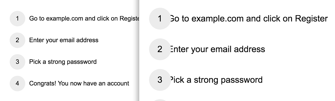
<ul class="list">
  <li>Go to example.com and click on Register</li>
  <li>Enter your email address</li>
  <li>Pick a strong password</li>
  <li>Congrats! You now have an account</li>
</ul>
.list li {
  position: relative;
  padding-left: 3.125em;
  margin-bottom: 1em;
  min-height: 2.5em;
}

.list li:before {
  font-size: 1em;
  width: 2.5em;
  height: 2.5em;
  text-align: center;
  line-height: 2.5em;
  border-radius: 50%;
}
在线Demo:http://codepen.io/shadeed/pen/9eb5d1e604e275a2dce29f161aca1809
一些Demo
相信你现在已经抓到关键点了,那么现在我们直接上一些Demo吧。
定位的图标:
http://codepen.io/shadeed/pen/67bbdf87c292767549ce1ae0f71861f6
“汉堡包”菜单图标:
http://codepen.io/shadeed/pen/cf7eac4b80b41bd011a6e7699d05bdb1
渐变:
我们可以对color stop使用em单位:
.box-1 {
  background:
    linear-gradient(
      to right,
      #4a90e2 0,
      #4a90e2 0.625em,
      #1b5dab 0.625em,
      #1b5dab 1.875em,
      #4a90e2 0,
      #4a90e2 3.125em
    );
  background-size: 1.25em 100%;
}
http://codepen.io/shadeed/pen/c30dacfa463f2862bf845ffd707228b5
雪碧图标:
http://codepen.io/shadeed/pen/a761b067a8b7094bf58d7c6fe450ece5
em和rem
我们前面主要使用了em。其实em还有一个亲戚属性叫做rem。rem仍然是一个相对单位,但这个相对是相对于根元素(比如html{}或:root{}),也就是说,凡是设置了rem的元素都会根据根元素的font-size来进行计算。
当我们把em和rem放在一起用时,我们可以保持一些东西的尺寸,而让另外一些尺寸是动态的。比如你想让这些组件内部的文字相对于根元素进行设置大小,但是其它元素(比如图片)则按照最接近元素的font-size进行计算:
在线Demo:http://codepen.io/shadeed/pen/f7fcc697cb69f606cd45e0a877379337
使用相对单位来做一个完整的页面
我做了一个完整的页面来向大家展示一下相对单位在实际工作当中的强大威力。
这里个页面中所有的东西都是可以动态缩放的,Logo、标签、标题、作者、按钮等等……
如果我们将浏览器的默认字体大小由16px改成20px,它将会做如下变化:
是不是很方便?!在线Demo:http://codepen.io/shadeed/full/d616aee645f87445b88df2a47d91dc95/
注意,示例使用了media query,font-size会随着页面的宽度变化而变化。
浏览器缩放
使用em来设置还有一个好处,那就是对于浏览器的缩放同样适用(按着Ctrl加+-号那种缩放视图)。
而如果使用px的话,则会变成这样:
使用em的一些注意事项
使用em时有一点需要注意的是:当你设置了font-size时,它是依据设置了font-size的并离它最近的祖先元素进行计算的:
.parent {
  font-size: 20px;
  .child {
    /* This is based on 20px, so it's 30px */
    font-size: 1.5em;
  }
}
但是,当我们设置的不是font-size属性,其它属性时,那么它就是基于本身的font-size来进行计算调整了:
.parent {
  font-size: 20px;
  .child {

    /* This is based on 20px, so it's 30px */
    font-size: 1.5em;

    /* This is based on 1.5em (not 20px), so it's also 30px */
    border: 1em solid black;

  }
}
这样可能会让你觉得不可思议:设置了不同的值,却得到了相同的结果~
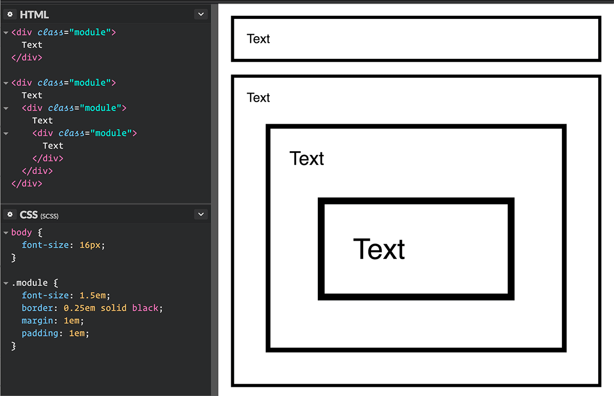
另外,还有一种情况就是使用em时导致的重叠效应,例如,你给一些组件设置了em单位,而这些组件是进行嵌套的,这就会导致尺寸的重叠计算:
总结
- 使用
px作为单位是非常难维护的。你可能需要根据不同的浏览器尺寸来设置每个元素的各各属性。 - 使用
em设置属性值的时候,可以让其根据font-size来进行计算,所以当改变font-size会同时缩放其所有设置了em单位的属性(包括那个重叠的有em的子元素) - 当使用
px时,可能会阻止浏览器设置的默认字体大小。


 加载中 ...
收学生吗
收学生吗老师